
We Made a Graph


Hello friend!
Here at Climate Town we almost never make our own graphs. We try to leave that to the professionals like scientists, academics, and the lovely graphics team at The New York Times, arguably the best part of that newspaper.
But these are not normal times. And so we have officially generated one simple and quite striking (beautiful even?) graph:

Gorgeous (exactly what we wanted).
But before we dive into our enchanting creation, please remember that you are free to go at any time. This is an opt-in only experience, and we’ve absolutely bolted that unsubscribe button to the top of this newsletter (higher than any local garden center would dare), in case you need an escape.
For the rest of you:
A Cooling Period
After we made our video about Landman and Taylor Sheridan’s oil propaganda blast-off on The Joe Rogan Experience, we got exactly what we deserved:
An algorithm full of clips of Joe Rogan!
And that led us to our latest video: once more into the Rogan-verse, now with Mel Gibson. But this time, they’re not just talking, they have a graph to bring up from this Washington Post article:
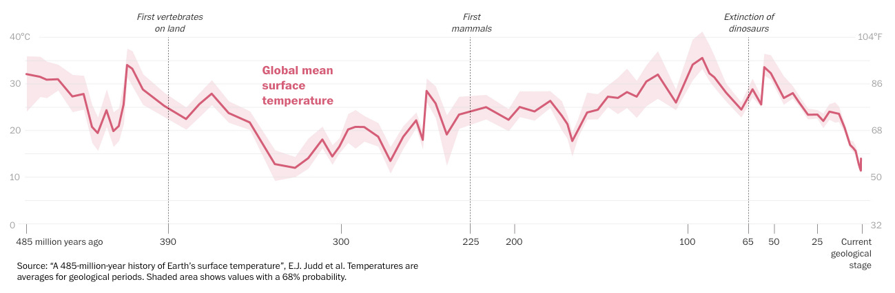
Apparently, the Smithsonian wanted to run an exhibit about some very old animals and the climate they lived in. But then they realized they didn’t have the climate data they needed, so a group of climate scientists spent years extrapolating climate data for this graph, covering the past 485 MILLION years of global average temperatures.
And if you see that graph at the top of the Washington Post article and it’s interesting to you, you could:
Read the rest of the article. Maybe even the original study.
Never read the article or the study, only look at the graph, come up with your own interpretation, and then talk about that all the time.
Do you think Joe Rogan went with option #1 or #2?
Again, we made a whole video about this, you can watch it right here. But we did want to use this time to quickly talk about something that’s often assumed in our videos, but never directly addressed:
Why are we concerned about climate change?
If you scroll about halfway down the article (congratulations for selecting Option #1), you hit a nice graphic that focuses on a particular section of Earth’s history, a mass extinction event around 250 million years ago, which is known simply as:
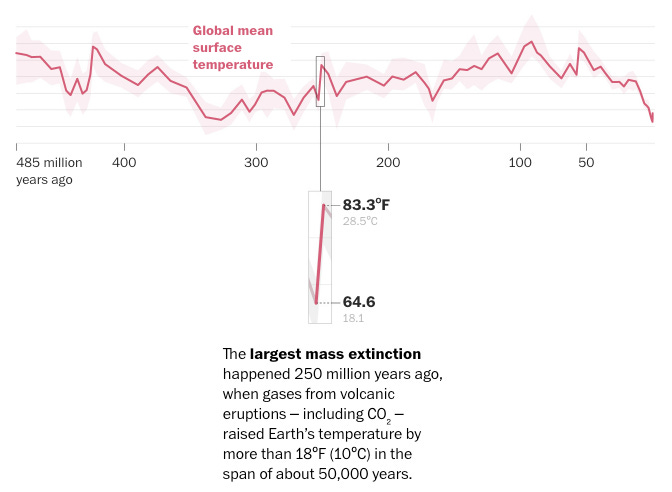
An accurately named event if ever there was one. Over the course of about 50,000 years, global average temperatures rose about 10 degrees Celsius, and that apparently led to 90% of all species on Earth going extinct. Or maybe you prefer this article that says this period “wiped out 96% of life on Earth”.
Which is f*cking crazy.
And what’s even crazier is that we made our own graph and now we can talk about it more:
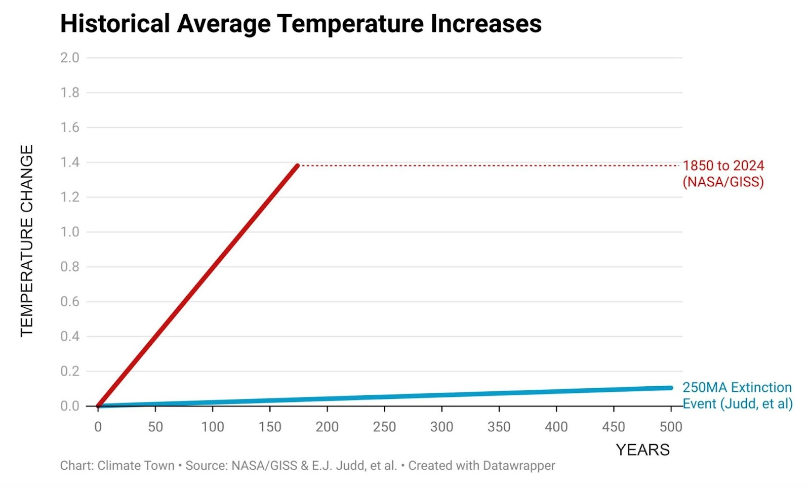
This graph has only two lines, but don’t let the simplicity fool you, it’s still very powerful and well made. It’s elegant.
The first line (reboot Smurf blue) is a linear representation of this former mass extinction. If we followed that rate of change for 500 years, the temperature on Earth would increase around 0.1C.
The second line (cherry, fire red) is our current average rate of temperature increase since 1850. This has given us a 1.4C increase over less than 200 years.
Based off these two lines, our human-induced climate change is happening FORTY times faster than maybe the most destructive climate-based extinction event in the history of our planet.
F*******ck.
And we might be underestimating our current rate of climate change here too.
Marking the temperature change from 1850 means including decades before the invention of the automobile or flight or commercial coal power plants. We’re currently blasting out more CO2 than ever – more than double what we emitted in the late 1970s.
So it’s not shocking to hear that some scientists believe we’re now entering our sixth mass extinction event. Another well-named and depressing event.
Again, we’re not making a habit of creating our own graphs. They usually require a lot of tedious calculations and trend lines and labels – it’s really a job for someone more artistic than we are. In this case, however, we wanted to visualize just how much more drastic our current temperature trend is than THE GREAT DYING trend, and the best way to do that was a nice, simple graph.
And that’s really what this Washington Post article is all about: as we study the previous climates of Earth, we’re learning that Earth is susceptible to climate change. It’s been hotter on Earth tens of millions of years ago, which shows there’s nothing preventing global average temperatures from rising and falling, even if that normally happens over millions of years, not hundreds. If the graph was a dead flat line, then maybe Rogan and the other skeptics would have a point: who gives a sh*t, the temperature on Earth hasn’t changed in 485 million years, no matter how much CO2 is hanging around.
But Joe Rogan could already know all of this if he just:
Read the article.
Because there are quotes like this one, from one of the authors of the study Rogan constantly references, Dr. Jessica Tierney:
Or maybe we can just wrap this part up with a quote from the lead author of the study, Dr. Emily Judd (from her interview for The Climate Brink, a great Substack run by two climate scientists, Andrew Dessler and Zeke Hausfather):
“I cannot stress how reductive and problematic this viewpoint is.”
Wow we probably could’ve skipped 98% of our video and just dropped that line.
But now maybe some good news from a graph?
Here at Climate Town, we read a lot of articles and studies and books. A lot of it is bleak and concerning. People ask us how work is going and then ask us to stop talking about it. But every once in a while, we read something that actually gives us hope.
And for a blink of hope today, here’s a graph from this Carbon Brief piece, referencing this IEA 2025 mid-year electricity update:
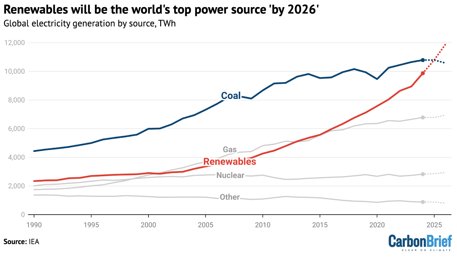
That’s right:
Within the next couple years, renewable energy is on track to become the top power source (by electricity generation) in the world.
But wait there’s more:
And with renewables and nuclear combined, we’re very close to getting half of all global electricity from low-emission sources.
Good news!
But, as with a lot of climate change, there’s also some less good news.
Even though people mix and match the terms energy and electricity, there are actually three main categories of energy: one is electricity, but we also have transportation and heating. This full scope includes gas for cars, oil for heating, coal for industrial use, etc. So while our electricity production decarbonizes percentage-wise, that’s only around 21% of global final energy consumption, according to the IEA.
If we look at total primary energy consumption in 2024 (primary energy measures energy totals before conversion, like coal before it’s burned), we get a different, much higher emissions mix, dominated by fossil fuels – brought to you by the good folks at Our World in Data, including the wonderfully informative Substack writer Hannah Ritchie:
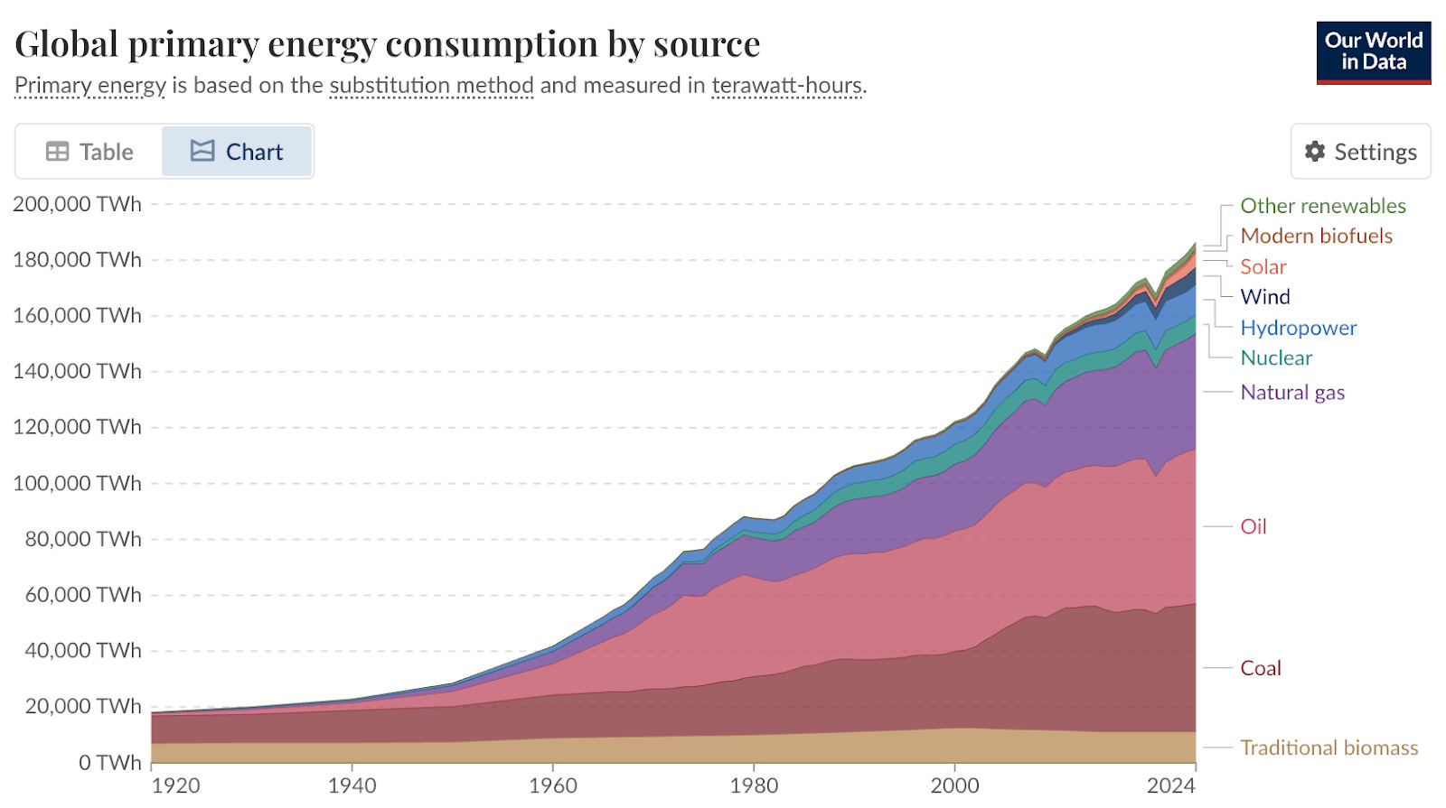
It’s this graph that’s the primary concern for carbon emissions and the climate change they bring. Fossil fuels are the #1 driver of human-caused climate change, so reducing our consumption is the best way to avert a crisis driven by an EXTREMELY fast increase in global temperatures.
And if we’re making good progress on lowering electricity emissions, we need to find a way to work on the other two categories. That’s why we’re trying to electrify as much as we can. Instead of exploding natural gas in your house for cooking an omelette, maybe that pan could be heated by an induction stove powered by electricity.
We could also just reduce the energy input we need. Right now a lot of Americans blow up gasoline to go to the grocery store, but maybe we could design our cities so we could walk or bike? And that idea’s not a conspiracy theory, even though it became one to Joe Rogan. We just think it’s nice to walk somewhere without having to hike through drainage ditches to cross 12-lane highways all the time.
And we should remember:
We are making progress.
Renewables are far and away the top choice for meeting additional electricity demand in the short term, while natural gas turbines are backed up and new nuclear is mostly years away – that’s not even necessarily an emissions/climate choice, that’s just practical supply and demand, especially in China, where they’re adding electricity demand so fast that they accounted for more than half (54%) of all added electricity demand in the entire world last year.
And if we continue our global move to electrify, we really do have a chance at drastically reducing demand for fossil fuels.
Official Rollie (no prize)
Before Climate Town, Rollie had a previous life as one of the foremost YouTube billiards comedians in the world. A prestigious honor.
And so for this Official Rollie (no prize), you must send us the name of the greatest snooker player in the history of the game (without looking it up first). There’s really one name that should come up here, like Wayne Gretzky and hockey or The Terrible Tire and fine dining – if it’s not that one obvious name, you also have to provide an argument for why your pick is actually the greatest. If you select the correct name but provide an argument, your lack of confidence will render your correct selection incorrect. We don’t make the rules, that’s just the way it is.
And to be clear:
This has nothing to do with climate change. And there is no prize.
As for last edition, here are your Official Rollie (no prize) recipients:
Scott Hoppe
Korina Johnson
Emily Kennedy
Eddie Lehwald
Alisa L.
Frank Manna
Rebecca Vincent
Xamimus
Hermanth [Redacted]
How about that, friend?
Well that's the end of the newsletter. If you want to send in a question, all you have to do is respond to this email. Or contact us directly at newsletter@climatetown.tv. We may never answer it, but you never know.
Also, if you think you found a mistake, let us know. We try our very best to research and review our way to full accuracy, but it's a big world out there.
Edited by: Caroline Schaper
Legal support from: The Civil Liberties Defense Center
Executive produced by: Matt Nelsen and Rollie Williams
That is a good graph. One of the goodest.
I’m assuming that’s some kind of logarithm scale and not plain linear? I would imagine hockey stick rate growth somewhere around 1950 or so, which makes the graph even scarier.
Anyway, I’ll be unsubscribing because I only want good news forced into my eyeballs, clockwork orange style.
To be fair, a linear extrapolation of 50kyr is unlikely to be accurate. There could have been temperature spikes that led to extinctions. But I expect the geologic record didn’t preserve that level of granularity.